Transamerica Design System Case Study

Client: Transamerica
Role: Senior UX/UI Designer
Tools: Sketch, InVision, Zeplin, Abstract
Background
When I started at Transamerica, there were many different styles in our products. The design aesthetic, interaction patterns, and usability were incredibly fragmented across all products. After 6 months on the team, I started to create a design system to overhaul the whole Transamerica experience. It would become the proudest accomplishment of my career to date and the largest challenge I’ve ever worked on.
Design Exploration
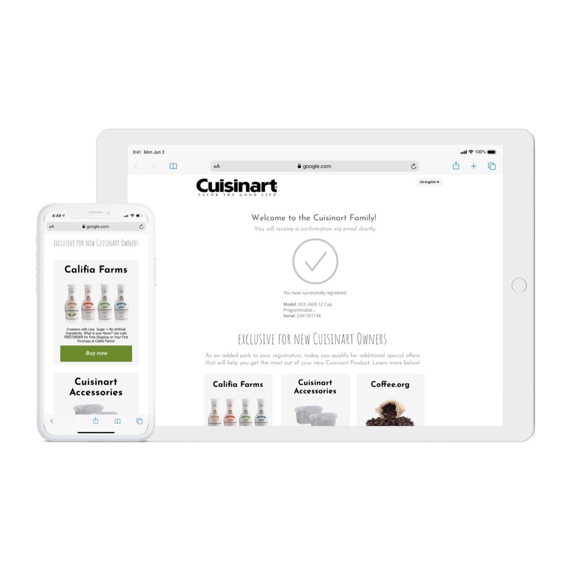
I knew that most of the content on the Transamerica public sites was data-heavy, web-based products. Simplicity, readability and load time were negatively impacted. I identified early on we were striving for a clear and clean aesthetic.
I started by experimenting within the public sites of Transamerica, discovering, establishing, and stress testing styles and a library of components and patterns. The direction, user interface and style changed over time based on frequent presentation and feedback from all of our channel partners, stakeholders and designers of all other products.
The Design System
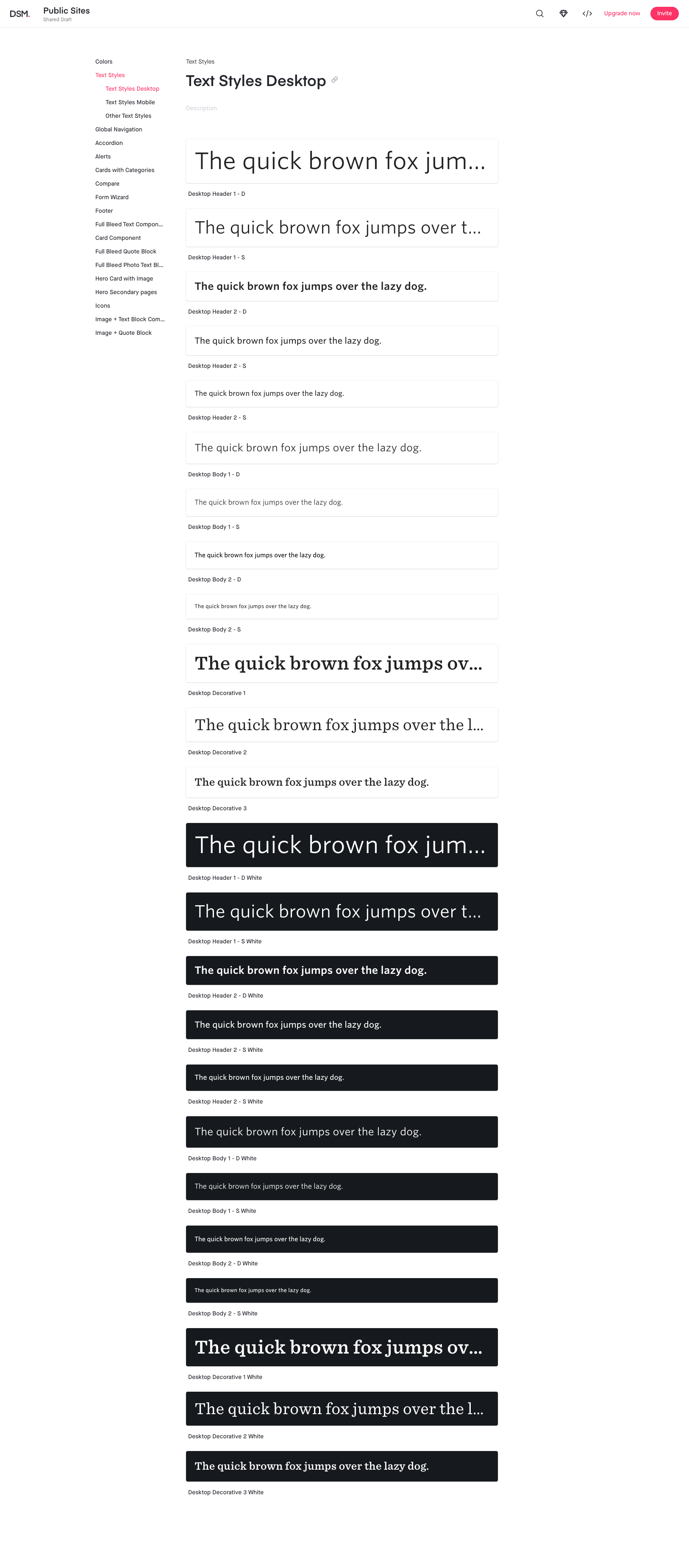
The system I created is predominantly white, black and red. It was important the design would not distract from the content, so subtlety was key. Each of the brighter colors are conveys a specific purpose. Red is used for primary actions, as red is Transamerica’s core brand color. This also presented a challenge as red is typically recognized as a warning or alert. Blue is used for links and secondary actions. The system supports the use of a variety of tertiary colors, since I foresaw the need for a variety of colors in data visualizations and other uses. I also incorporated the main brand typefaces in black and white variations and in a variety of weights and sizes.


Patterns and Components
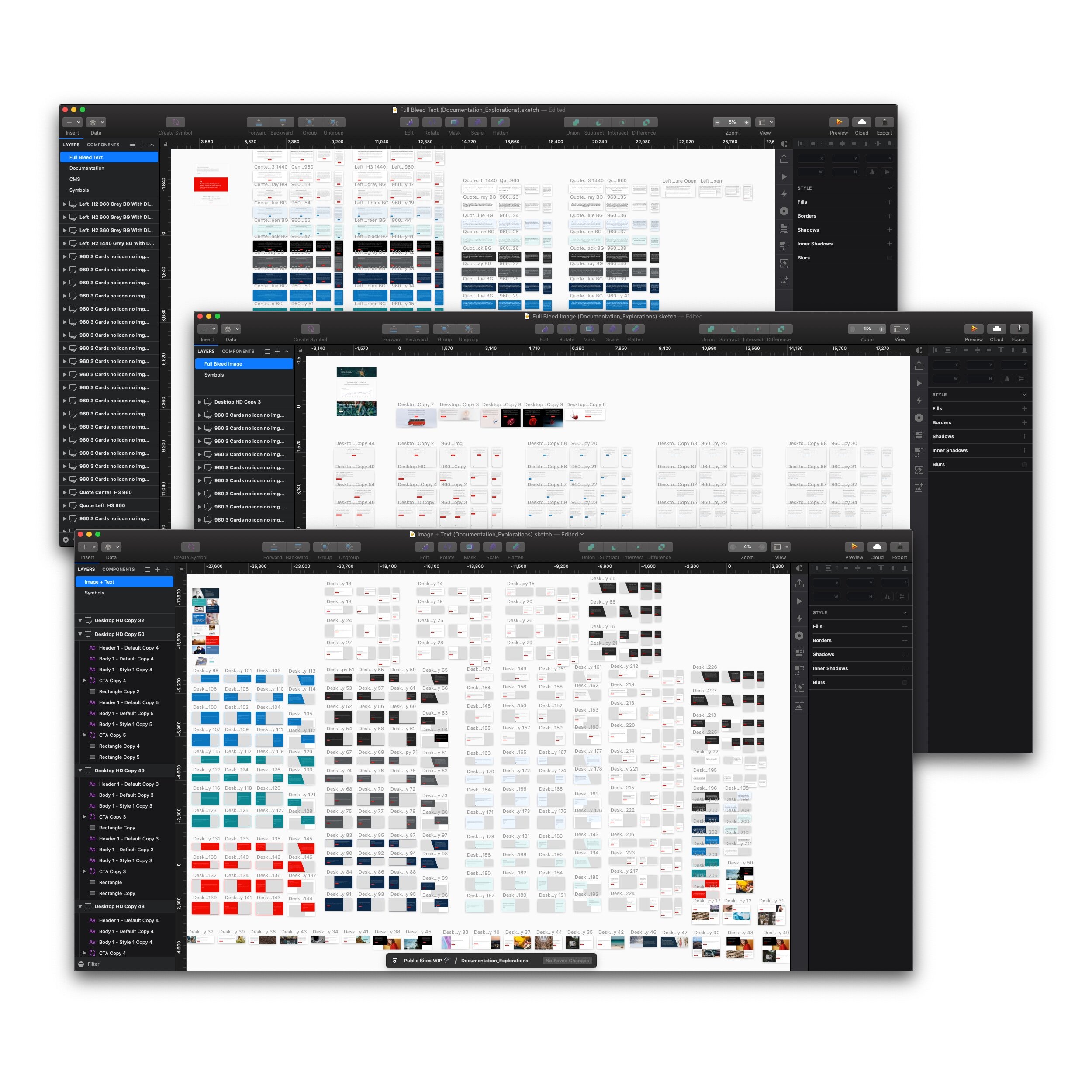
After the exploration, review, and iteration phases, I arrived at baselines styles I was happy with. The task now was to create an extensive suite of patterns and components, accounting for all states and scenarios. I set out to create a comprehensive UI kit for our team to use.
The system is made up of foundational elements, like the defined text styles for headers and content, color palette, patterns, components, and templates. Consistent UI patterns and components make a huge difference in guiding a user through the public sites of Transamerica, while creating a feeling of cohesiveness in our product.
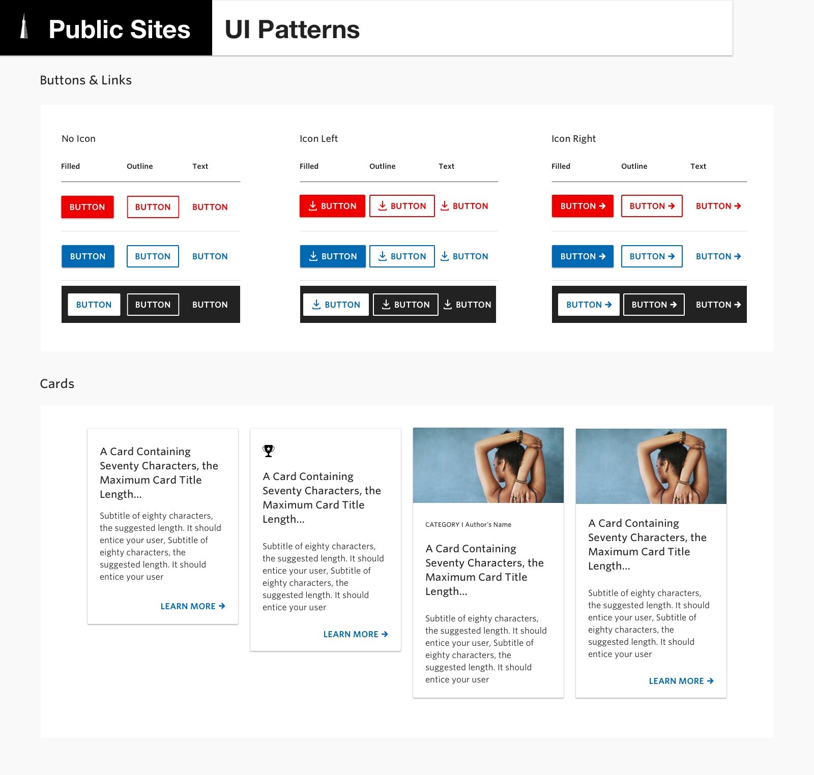

Patterns are the recurring elements or practices through the public sites of Transamerica. Examples include navigation, cards, tables, empty or loading states, notifications, alerts and modals. Patterns are versatile, can be contained in components, then paired to make up a template.
Components are distinctive UI elements used over and over through the public sites of Transamerica—normally actionable, sometimes to convey meaning.
Our tool of choice for UI design is Sketch paired with Abstract. The features that make Sketch great for product design make it especially powerful for system design. When I am creating hundreds of variation for components and exploring different ideas, Sketch’s simplicity becomes crucial. Abstract’s ability to roll back to any point and have libraries link to any new documents make the most sense for this case as the design system will grow, and more designers will collaborate and create components.


As I built the new components, I talked with the Content Manager Software (CMS) Team, and we explored the capabilities of our CMS in order to improve the experience of the CMS team and to improve the experience of building the web pages for Transamerica.com. At the same time, I built decision trees to facilitate use and limit the options of the new components.


I used InVision Design System Manager (DSM) to distribute the brand colors, text styles and components to the rest of the design team. This also allowed the team to share the components with our partners inside the company and with some of the marketing agencies that collaborate with Transamerica. At the same time, it allows for faster creation of page mockups for transamerica.com, reducing the time needed from the start of a project to the moment it is released.
Documenting a Design System
As I moved forward creating a design system, I recognized the importance of documenting my work, given that I will not be the only designer (or developer) who works with it.
Documenting the design system in detail was the biggest challenge for me on this project. I started by reading and researching how other teams had done this. Fortunately the Internet is full of examples of this, as many companies have made their documentation public.
After having seen so many great examples online, I wanted to create a website to document the system, its specs, showcase example uses, and specify guidelines for all patterns and components. Due to the private nature of Transamerica’s business, a publicly consumable website was not possible. Below are some screen grabs to give a good idea of the construction, layout, and contents.


With every new project, I further stress-tested, learning and improving upon the design system. Transamerica’s core marketing website, Transamerica.com, is the testing ground to iterate on this new design system. Work has begun to design new patterns with this design system foundation and its components, to be released in iterations starting in 2020. Throughout this case study is a preview of what's to come!
Other Selected Work